WordPress 7.1 introduces native responsive block styles, making it easier to create mobile-friendly layouts without relying on custom CSS media queries. Learn how responsive block styles work, how to configure them in theme.json, and how to avoid common styling conflicts while improving website performance.
WordPress 7.1 Introduces Native Responsive Block Styles
Responsive design has always been one of the most important aspects of modern web development. Visitors expect websites to look perfect whether they are browsing on a desktop computer, tablet, or smartphone. Until now, WordPress users often relied on custom CSS media queries, page builder settings, or theme-specific options to create responsive layouts.
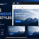
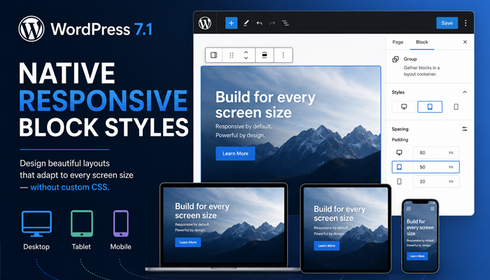
WordPress 7.1 changes this workflow significantly by introducing native responsive block styles directly into the Block Editor. Instead of writing large amounts of CSS, developers and site owners can configure responsive styling using built-in tools that integrate with the editor and theme.json.
This update makes responsive design easier to manage, more consistent across themes, and much simpler for beginners while still giving developers complete control when needed.
Why This Feature Matters
Responsive web design has become a standard requirement rather than an optional enhancement. More than half of global website traffic now comes from mobile devices, meaning poor mobile layouts directly affect user experience, conversions, and SEO rankings.
Native responsive block styles provide several important advantages:
- Less custom CSS to maintain
- Cleaner and more organized code
- Better compatibility with future WordPress releases
- Faster development workflow
- Improved consistency across blocks
- Easier maintenance for long-term projects
- Better Gutenberg integration
Instead of manually writing dozens of media queries, many responsive adjustments can now be configured directly through WordPress.
How Responsive Block Styles Work
Responsive block styles allow individual Gutenberg blocks to automatically change their appearance depending on the visitor’s screen size.
Instead of relying entirely on CSS media queries, WordPress generates responsive styling based on configuration values.
For example, a Group block may:
- display horizontal padding on desktop
- reduce padding on tablets
- remove extra spacing on smartphones
A Columns block may:
- display four columns on desktop
- change to two columns on tablets
- stack vertically on mobile
The editor now understands different viewport sizes and can apply styles accordingly.
This makes the editing experience much closer to what visitors actually see.
Supported Style Properties
Depending on the block, responsive settings may include:
- Padding
- Margin
- Gap
- Width
- Minimum height
- Typography size
- Alignment
- Spacing
- Layout
- Visibility (where supported)
Future WordPress versions are expected to extend these capabilities even further.
Default Mobile and Tablet Breakpoints
WordPress introduces standardized responsive breakpoints that help themes behave consistently.
Typical breakpoints include:
| Device | Approximate Width |
|---|---|
| Mobile | up to 781px |
| Tablet | 782px–1024px |
| Desktop | 1025px and above |
These values closely match the breakpoints already used throughout the WordPress admin interface.
Using consistent breakpoints helps prevent unexpected layout shifts between themes and plugins.
Why Standard Breakpoints Are Better
Previously every theme could define its own media queries:
@media(max-width:768px)or
@media(max-width:800px)or
@media(max-width:991px)After years of development this often resulted in inconsistent behavior between plugins and themes.
WordPress now encourages a standardized responsive system.
Configuring Styles in theme.json
The heart of modern WordPress styling is the theme.json file.
Instead of storing dozens of CSS rules, themes can define layout behavior centrally.
A simplified example might look like this:
{
  "settings": {
    "layout": {
      "contentSize": "760px",
      "wideSize": "1280px"
    }
  },
  "styles": {
    "spacing": {
      "padding": {
        "top": "40px",
        "bottom": "40px"
      }
    }
  }
}
The advantage of theme.json is that many style changes become available directly inside the Block Editor.
Developers can expose spacing, typography, colors, layouts, and responsive options without writing additional CSS.
Why theme.json Is Replacing Large CSS Files
Many modern themes are moving styling logic into theme.json because it provides:
- easier maintenance
- centralized configuration
- better editor integration
- improved performance
- fewer duplicated CSS rules
Instead of editing multiple files, many design settings now live in one location.
Styling Individual Blocks
One of the biggest improvements is that responsive settings can apply to individual blocks rather than entire pages.
Examples include:
Image Block
Desktop:
- width 100%
- border radius 20px
Tablet:
- smaller radius
- reduced margins
Mobile:
- full width
- minimal padding
Cover Block
Desktop:
- 700px height
Tablet:
- 500px height
Mobile:
- 350px height
Columns Block
Desktop:
4 ColumnsTablet:
2 ColumnsMobile:
1 ColumnNo custom CSS may be required for many common layouts.
Group Block
Spacing can automatically shrink on smaller screens.
Desktop:
Padding: 80pxTablet:
Padding: 50pxMobile:
Padding: 20pxThe result is cleaner layouts without manually writing media queries.
When You Still Need Custom CSS
Native responsive styles reduce CSS requirements, but they do not eliminate them entirely.
Custom CSS is still useful for:
- advanced animations
- complex hover effects
- custom grid systems
- highly specialized layouts
- third-party plugin styling
- browser-specific fixes
Think of responsive block styles as replacing the repetitive CSS rather than every CSS rule.
Avoiding CSS Specificity Conflicts
One of the biggest problems developers encounter is CSS specificity.
Imagine a theme already contains:
.wp-block-group{
padding:80px;
}
Then responsive block styles generate:
padding:20px;If the original selector has higher specificity, WordPress may be unable to override it.
This results in layouts that look different from what the editor displays.
Best Practices
Avoid using:
!importantunless absolutely necessary.
Keep selectors simple.
Prefer:
.wp-block-groupinstead of:
body.home main article .entry-content .wp-block-groupWhenever possible, allow WordPress-generated styles to control spacing.
Reduce Duplicate Rules
Many older themes include years of accumulated responsive CSS.
Before adding new rules:
- check whether WordPress already generates them
- remove unnecessary media queries
- simplify selectors
- avoid duplicated spacing definitions
Less CSS usually means:
- faster rendering
- easier maintenance
- fewer conflicts
Migrating Existing Themes
If your theme already contains hundreds of responsive media queries, migration should happen gradually.
Recommended process:
- Update to WordPress 7.1.
- Test your current design.
- Remove only duplicated responsive CSS.
- Replace those rules with native block styles.
- Verify desktop, tablet, and mobile layouts.
- Repeat section by section.
Avoid deleting all responsive CSS at once.
Performance Benefits
Removing unnecessary CSS provides several measurable advantages.
Benefits include:
- smaller stylesheet size
- fewer media queries
- reduced render-blocking CSS
- easier browser parsing
- cleaner HTML output
- improved maintainability
Although the performance improvement varies between websites, reducing CSS complexity almost always helps long-term optimization.
Compatibility With Existing Themes
Most block themes will benefit immediately from native responsive block styles.
Classic themes can also take advantage of many improvements, although full integration depends on how the theme has been built.
Themes that already use theme.json generally require fewer changes than older themes relying entirely on traditional CSS.
Popular block-based themes are expected to adopt these features quickly.
Tips for Plugin Developers
Plugin developers should consider:
- respecting
theme.json - avoiding unnecessary inline styles
- using WordPress block APIs
- minimizing hardcoded breakpoints
- testing across multiple themes
- avoiding excessive CSS specificity
Following WordPress standards ensures better compatibility with future releases.
Testing Responsive Layouts Before Updating
Never deploy responsive changes directly to a production website.
Instead, create a staging environment and thoroughly test your layouts.
Recommended Testing Checklist
- Desktop (1920px)
- Laptop (1366px)
- Tablet landscape
- Tablet portrait
- Android phones
- iPhone models
- Large monitors
- Small mobile screens
Also verify:
- navigation menus
- images
- galleries
- forms
- buttons
- typography
- spacing
- embedded videos
- WooCommerce pages
- custom blocks
Testing across multiple browsers remains essential.
Recommended browsers:
- Chrome
- Firefox
- Edge
- Safari
Small layout issues often appear only on specific devices.
Practical Migration Example
Imagine an older landing page with over 300 lines of responsive CSS controlling spacing.
After migrating to WordPress 7.1:
- half of the media queries are removed
- spacing moves into native block styles
- typography scales automatically
- fewer CSS overrides remain
- maintenance becomes much easier
The visual result stays nearly identical, but the codebase becomes significantly cleaner.
Best Practices for Responsive Block Styles
To get the best results:
- Keep
theme.jsonorganized. - Avoid duplicate media queries.
- Use native spacing controls whenever possible.
- Test every breakpoint before publishing.
- Remove outdated CSS gradually.
- Keep custom CSS only for advanced layouts.
- Review pages after major WordPress updates.
- Test accessibility alongside responsiveness.
- Monitor Core Web Vitals after deployment.
Following these practices will help your site remain fast, maintainable, and compatible with future WordPress releases.
Frequently Asked Questions
What are WordPress responsive block styles?
They are native responsive styling options introduced in WordPress 7.1 that allow blocks to automatically adapt to different screen sizes without requiring extensive custom CSS.
Do responsive block styles replace CSS media queries completely?
No. They replace many common responsive adjustments, but advanced layouts and custom effects may still require traditional CSS.
Do I need a block theme?
No. Block themes benefit the most, but classic themes can also use many responsive styling improvements depending on their implementation.
Does this improve website speed?
Reducing unnecessary CSS and duplicated media queries can improve maintainability and may contribute to faster page rendering.
What is theme.json?
theme.json is WordPress’s central configuration file for theme settings, styles, typography, colors, layouts, and many editor features.
Will existing websites break after updating?
Most sites will continue working normally. However, websites with heavily customized responsive CSS should be tested carefully before removing any existing styles.
Are plugins affected?
Most plugins continue working normally. Developers should ensure their blocks follow modern WordPress styling practices.
Can beginners use responsive block styles?
Yes. Many responsive settings are available directly within the Block Editor, reducing the need to write CSS manually.
Should I delete all responsive CSS after updating?
No. Migrate gradually by removing only CSS that duplicates native WordPress functionality.
Is this feature good for SEO?
Indirectly, yes. Cleaner layouts, better mobile usability, and simplified CSS maintenance can contribute to improved user experience, which supports overall SEO efforts.
Build Responsive WordPress Sites
WordPress 7.1 represents another important step toward a fully visual, block-based editing experience. Native responsive block styles reduce reliance on lengthy media queries, simplify theme development, and help create consistent layouts across desktop, tablet, and mobile devices. While custom CSS still has its place for advanced designs, many everyday responsive tasks can now be handled directly through WordPress itself. Adopting these features gradually will make your projects easier to maintain, improve compatibility with future updates, and provide a smoother editing experience for both developers and content creators.
Disclaimer
This article is intended for educational purposes. Always test responsive changes in a staging environment before applying them to a live website. Information is based on WordPress development practices and publicly available documentation. Theme implementations and future updates may introduce additional functionality.
By using Tips4WP.com, you acknowledge that you have read, understood, and agreed to this disclaimer.
Tags: WordPress 7.1, WordPress responsive block styles, Gutenberg, Block Editor, Responsive Design, theme.json, WordPress Development, Mobile Optimization, CSS, WordPress Tips
Hashtags: #WordPress #WordPress71 #Gutenberg #ResponsiveDesign #ThemeJSON #BlockEditor #WebDevelopment #CSS #SEO #WordPressTips
Sources and References
Primary Sources
- WordPress Core Development (Make WordPress Core)
- WordPress Developer Resources
- Gutenberg Project Documentation
- WordPress Theme Handbook
Secondary Sources and Testimonials
- Experienced WordPress theme developers
- Gutenberg contributors
- Web performance best practices
- Community feedback from early WordPress 7.1 testing
Have you started testing WordPress 7.1 responsive block styles? Share your experience, favorite improvements, or questions in the comments below.